Responsive images with the image-set() CSS function
Art Direction
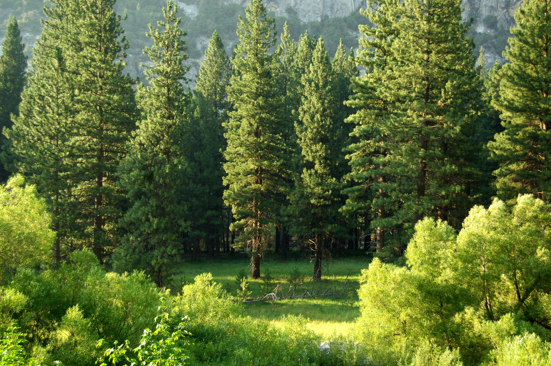
This image has a fixed height of 400px with the width taking the full
width of the screen but having a maximum width of 1400px. It doesn't
have any specific detail that it is showing to the user, hence looks
good on any screen size and because the image has been set to adjust
itself to cover any space it finds itself in, it doesn't look stretched
on any screen size.
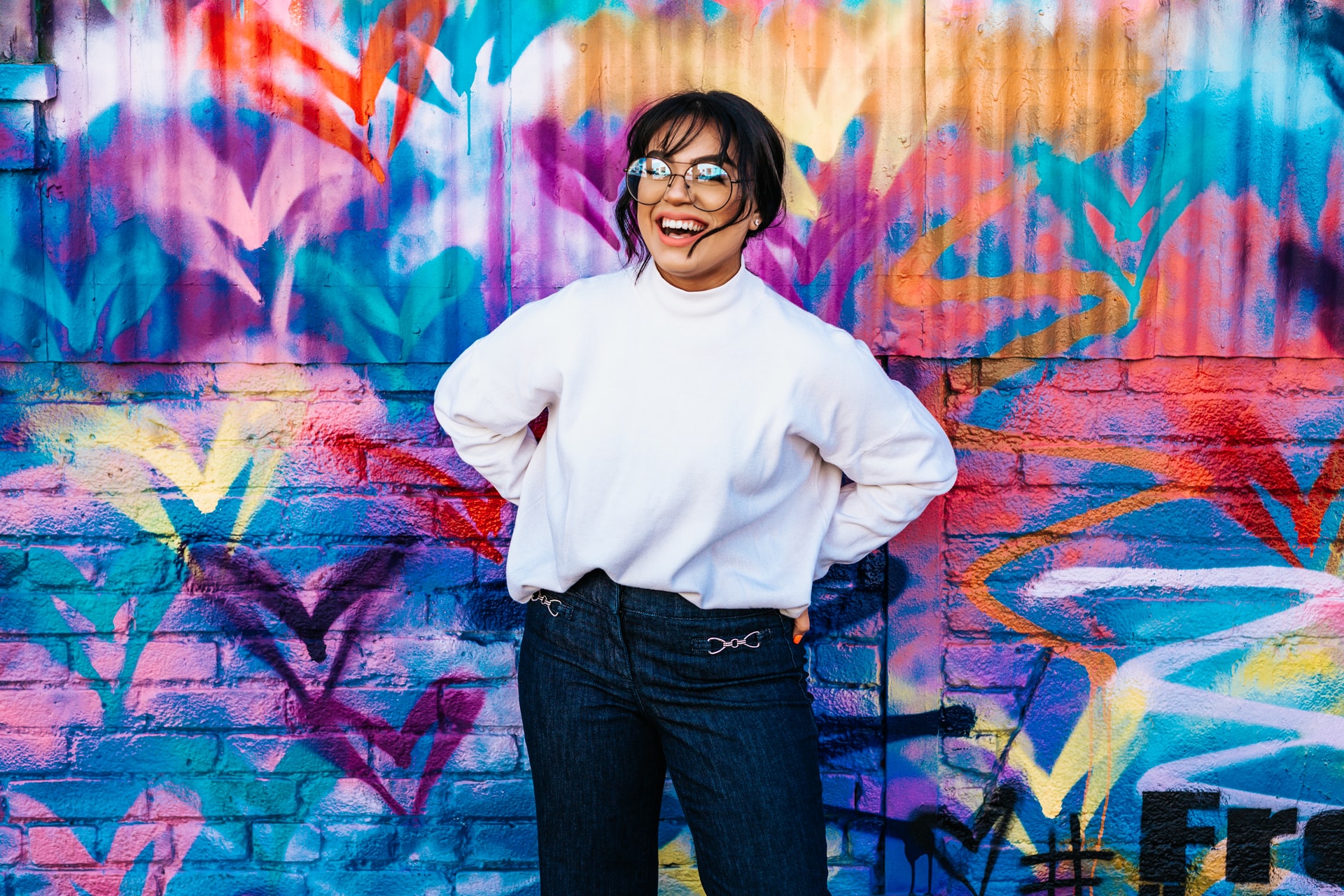
This image has a fixed height of 700px with the width taking the full
width of the screen but having a maximum width of 1400px. Its main focus
or detail to the user is the lady. Its orientation is landscaped. This
image also adjusts itself to cover any space it finds itself in, but
unlike the first image which looks good on any screen size, this
doesn't. On smaller screens, parts of the lady get cut off and she then
becomes too large for the user to view.
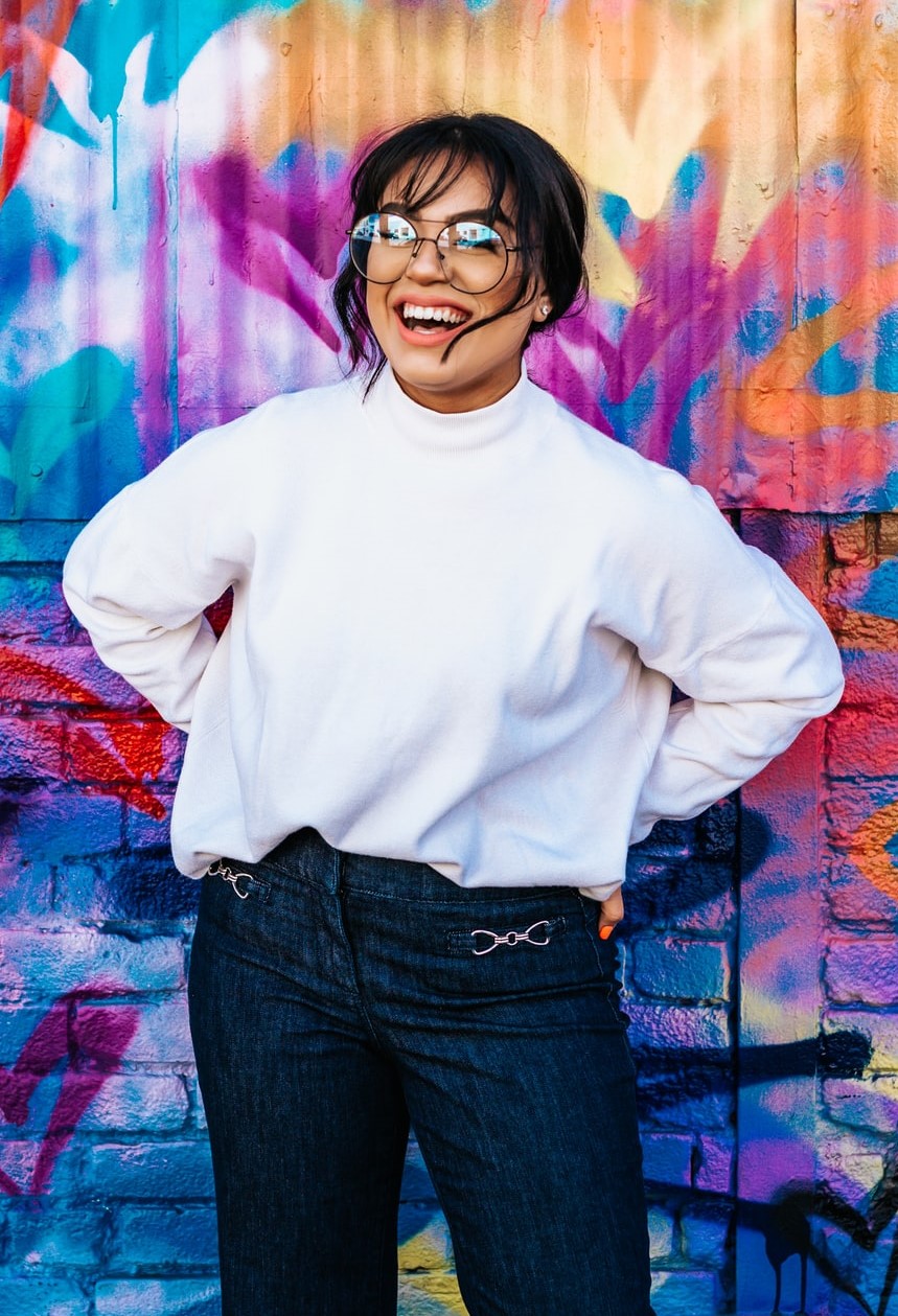
With the same image used above, we have removed the fixed height and
object fit but left the width the same and its orientation is still
landscaped. On different screen sizes, it maintains the same aspect
ratio, adjusting the height of the image to accommodate its relative
width so we can see every major and minor detail in it. We can easily
view the lady in the image on larger screens but not on smaller
screens.If we switch the image from the landscaped orientation to a version of
it in portrait orientation and use it on smaller screens, we can then
easily see the details of the lady once again. But when using this same
image for larger screens, it becomes too large for the user to view the
image or lady at first glance.