Responsive images with the image-set() CSS function

Resolution Switching

Here we see the same image with five different pixel resolutions and file size. Adjust the width of the screen to see how the resolution of each image displays on different screen sizes.

If you have two or more screens with the same width but different screen resolution, you can view this example on each of them simultaneously and compare the images side by side.

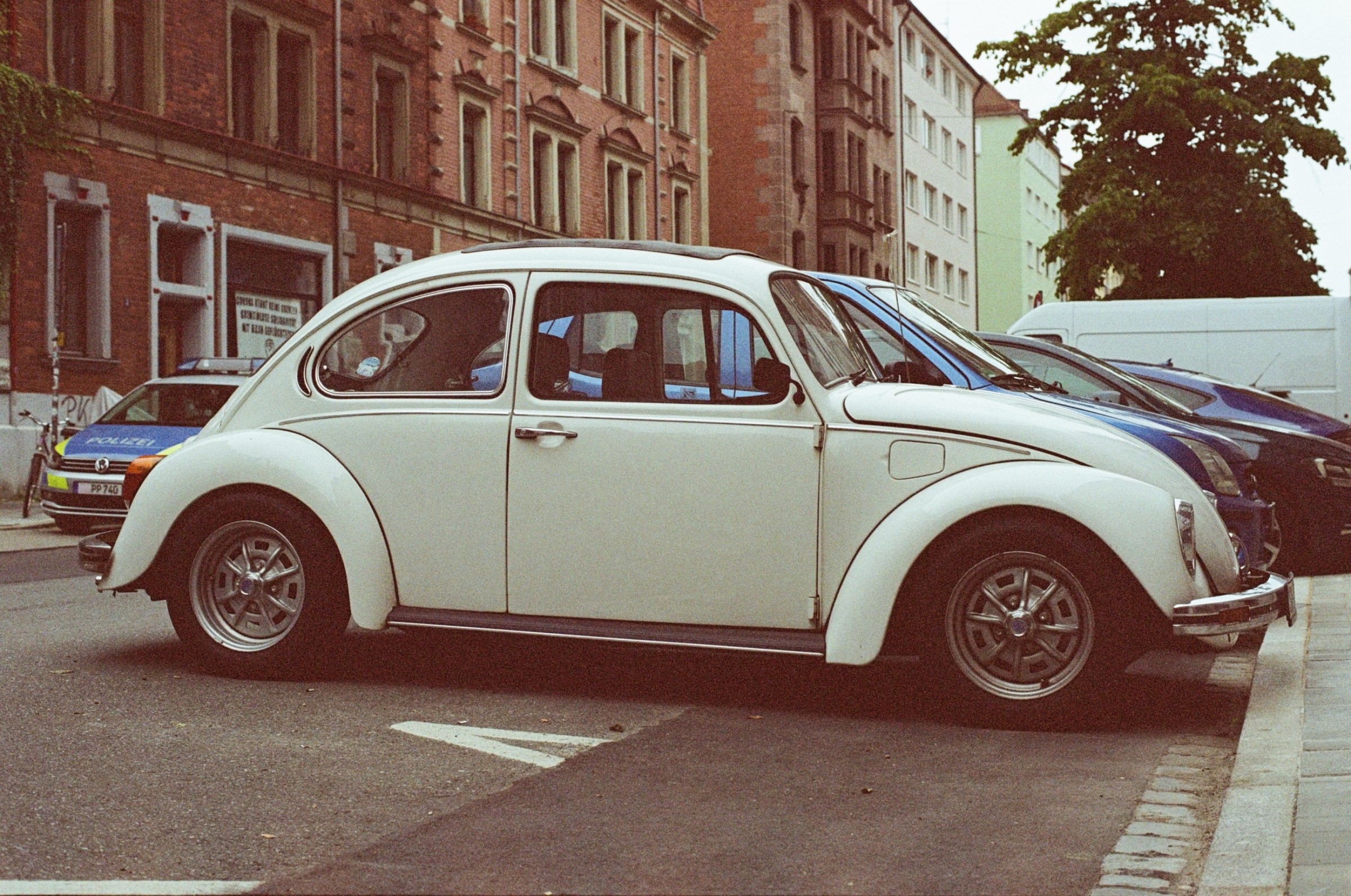
3500x2321px image of a white beetle car, Size 2.4mb
3500x2321px image. Size 2.4mb.
2400x1592px image of a white beetle car, Size 1.19mb
2400x1592px image. Size 1.19mb.
1200x796px image of a white beetle car, Size 323.51kb
1200x796px image. Size 323.51kb.
640x425px image of a white beetle car, Size 60.67kb
640x425px image. Size 60.67kb.
640x425px image of a white beetle car, Size 23kb
300by199px image. Size 23kb.
640x425px image of a white beetle car, Size 17.7kb
150by100px image. Size 7.17kb.

Photo by Markus Spiske on Unsplash